Trello’s Inbox feature set out to solve a deceptively simple problem: before users can organize anything, they have to capture it. The extra steps of deciding which list and board to place a card in added enough friction that users frequently turned to other apps instead of Trello. The opportunity was to define a mobile Inbox strategy that took advantage of unique capture opportunities for the platform.
I led mobile design and strategy for Inbox across a multi-phase rollout. I worked closely with the web team to deliver a cohesive experience while making deliberate, platform-specific decisions to elevate the user experience.
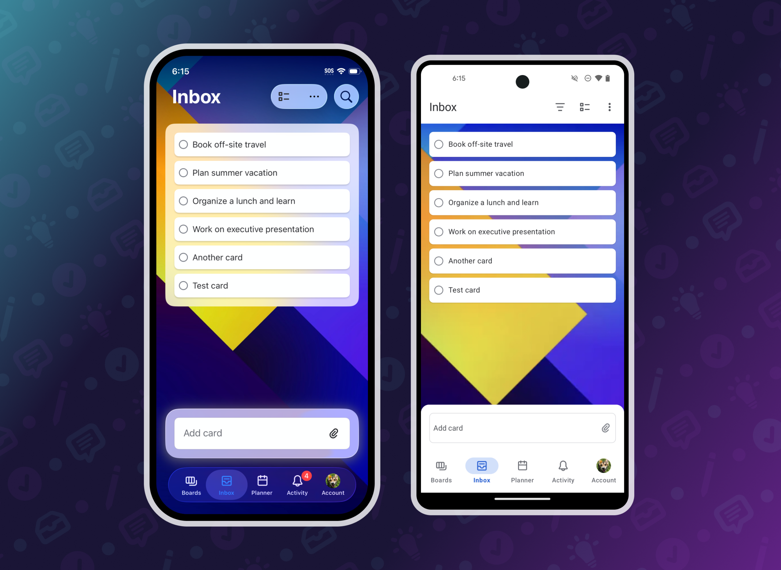
Card creation in Inbox
Cards added to Inbox appear at the top of the list, the opposite of how cards behave on boards. On web, the card creation input was positioned at the top of Inbox to match the card position. On mobile, I wanted card creation to stay within easy reach while looking distinct from card creation on the board.
I designed a persistent text input anchored near the bottom of the screen that floated on top of the content. It kept content input close to the on-screen keyboard while setting it apart visually from card creation on a board. The goal wasn’t just a different UI element, it was helping users understand that Inbox works differently.
This portable component was also the base for the quick add tile, making it flexible and reusable.

Quick add, widgets, and more
The mobile apps had a unique opportunity to unlock card creation outside of Inbox: widgets, voice, and share sheet integrations were all surfaces I saw potential in for driving faster capture.
I designed a quick add tile, which was accessible in the app and as a home screen widget. Both locations gave users a way to capture content in as few taps as possible. Additionally, I redesigned the share sheet experience to default to Inbox, significantly speeding up the process of adding cards from websites or other apps. For even faster capture, I added Siri integrations so users could add content hands-free.
Quick add became a primary driver for content creation. Making it easy to keep track of tasks and information in one place drove adoption for Trello’s personal productivity features.

Organizing cards in boards
On web, Inbox displays alongside boards, making drag-and-drop a natural way to move content between them. On mobile, each surface is its own dedicated view, so replicating that pattern directly wasn’t feasible or appropriate.
The alternative mobile solution I designed was multi-select. This feature sped up card management on mobile and provided a unique toolset for users looking to manage multiple cards at once. Users could select many cards at once and either archive them or move them to a board. This feature also provided a more accessible management option for users who could not drag cards.
As we rolled out multi-select, I noticed a gap. Users organizing just one or two cards still had to tap into a card to move it, adding unnecessary steps. We had an existing pattern on boards that let users drag cards to a hot zone to archive them. I expanded that logic to include moving a card or adding it to Planner. Dragging a card to the hot zone opens a bottom sheet where users can confirm the details, giving them speed without losing visibility or control.
Keeping the design system current across phases
With each phase of Inbox, it was important to ensure that new patterns were reflected in the mobile design system. Standard mobile components were used first to stay consistent with navigation and other core surfaces across the app and custom components were used where needed (such as cards).
In some cases, new components needed to be created or existing ones expanded to fit a new use case. As the owner of the Trello Mobile design system, I tracked changes to existing components through a change management process. I shared weekly summaries across the organization, giving visibility into updates and work happening on the system.
Having a shared design system created a shared language between design and development. We all understood what components were, what they were supposed to do, and their limitations. I worked with developers to establish naming conventions for colors and icons and documented component behavior to improve reusability. For new components, I wrote annotations that moved from projects to the design system, so context traveled with the work.
I made a deliberate choice to add new components to the system only after a phase of work was shipped. This reduced documentation that would need to be reworked as designs evolved from concept to code. This kept the system a reliable reference for functionality and components actually available in the app.

Creating alignment
Keeping leadership aligned on why mobile needed its own solutions was as important as the design work itself. I recorded weekly progress updates and presented our vision for each phase alongside project management and the mobile development team, making the case that cohesion comes from shared outcomes, not identical interactions.
Alignment with the web team mattered just as much. I kept the web designer and PM in our mobile working sessions and proactively flagged changes as they happened. As a result, important functionality never felt like it was missing on either platform at any phase of the rollout.
Results
As we released functionality to more users, data and user feedback made it clear that rooting intentional deviation in behavior created clarity rather than confusion.
Inbox became a cornerstone feature for the product. Mobile users engaged with Inbox at a higher rate than on web, reflecting how well the platform-specific approach served user’s needs.
Staying aligned on goals rather than specific implementations meant the experiences felt consistent across platforms while remaining intuitive for the context. This approach shaped work on future projects, too. I carried forward what I learned about cross-team communication and kept the web team involved in mobile working sessions.


This phase was focused on establishing the foundation of Inbox. I worked within the existing navigation patterns to speed up getting this feature into the app so we could experiment with interactions.
Key features : quick add tile, adding cards, viewing card fronts, opening card back