Trello had recently pivoted toward personal productivity, adding a range of new features aimed at individual work rather than project management. The problem was that users had no way to understand this shift. The existing onboarding experience was built around a team-focused model and assumed most people would arrive through a work context. In practice, users were landing on empty screens with no guidance which hindered our new user retention.
Existing users weren’t faring much better; new features like Inbox lacked the context needed to explain their value. Without understanding what Inbox had to offer over a board, most users were ignoring Inbox. Early data showed Inbox adoption was low before we invested in discovery.
I led the strategy and design for new user onboarding across mobile, owning the experience from early exploration through experimentation and iteration.
Finding the right approach
Rather than thinking about new and existing users separately, I wanted to build a single framework that could serve both. I also felt it was important to use existing surfaces and patterns instead of bespoke, one-time UI that users would never encounter again.
To get started, I ran a feedback loop workshop with the project manager, engineers, and content strategist collaborating with me on this work. We mapped out gaps and opportunities to help users move effectively through the core loop of capture -> organize -> done and generated ideas on how onboarding and discovery work could support that journey.
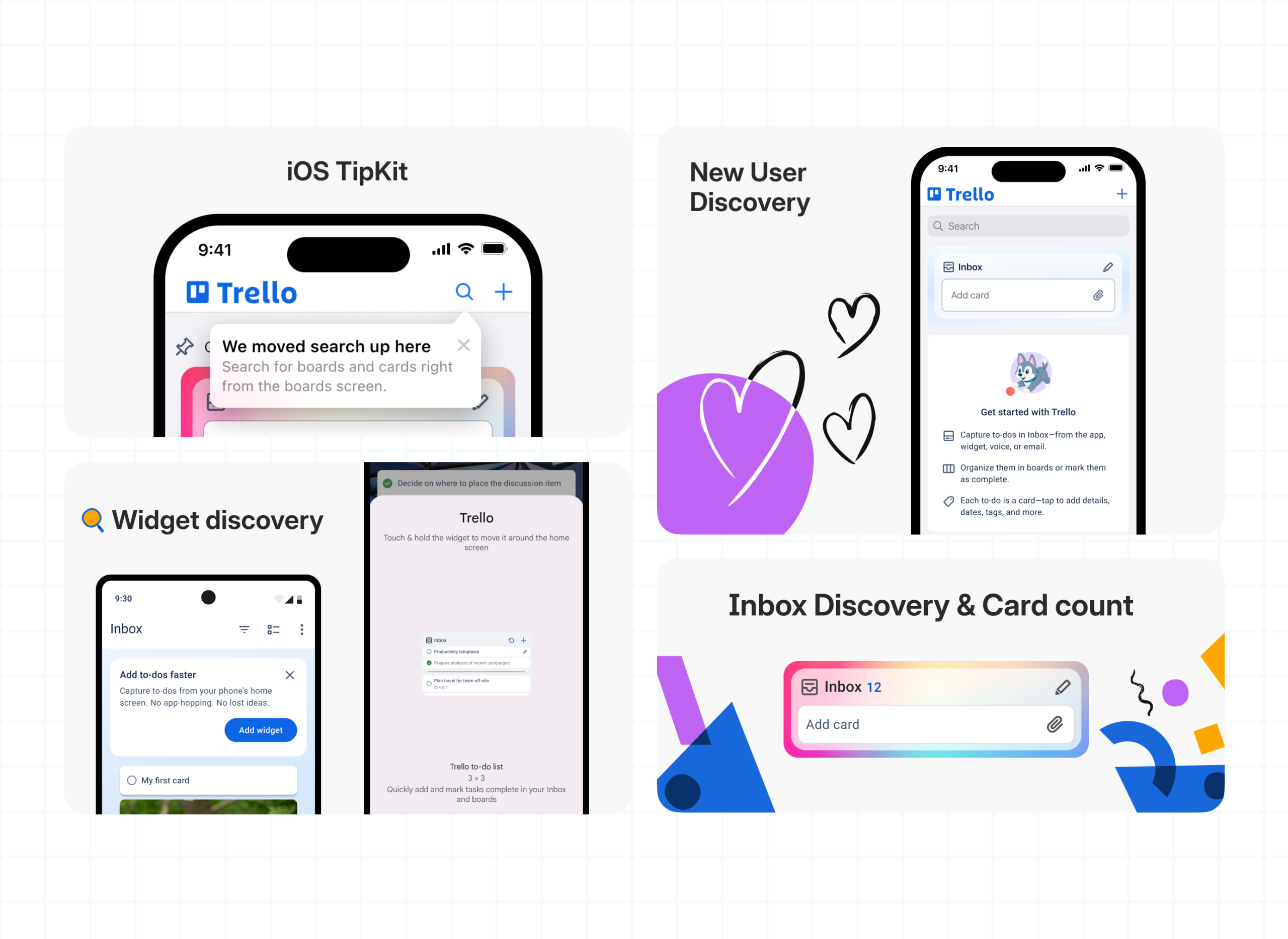
After better understanding the opportunity, The team and I decided to pursue an intentionally low-lift phase. This phase would introduce empty states with character illustrations on Boards and Inbox to help users create their first cards. Empty state content highlighted key features of capturing, organizing, and getting things done within the app.
On Boards, each element of that loop was reflected in the empty state messaging. On Inbox, the focus narrowed to capture and privacy to build confidence that Inbox content is visible only to them. Knowing that content in Inbox was private is one of its primary differentiators over Boards, especially for enterprise users.
This small change drove an increase in new feature discovery simply by giving users context rather than a blank screen. That signal gave me confidence to explore additional opportunities.
Running an experiment to learn
The next question was whether providing starter content alongside the empty states would further drive feature discovery. Starter content could help us address areas where users dropped out of the core loop without needing to rely on in-app messaging or prompts.
Additionally, I wanted to resolve a strategic question about where to land new users when they first opened the app. Based on our data and user behavior, I believed we should start new users on a board. Newer features like Inbox benefited from familiarity with boards, lists, and cards. Starting with Inbox first made it harder to understand those core concepts. Leadership felt strongly that Inbox should come first, given that it was a new feature and central to the product strategy.
To resolve this impasse, my mobile PM partner and I proposed running a controlled experiment. This kept us moving and ensured the decision would be grounded in user behavior rather than internal preference.
We built three experiences: one that started users on a board with starter content, one that started them in Inbox with starter content, and a control using only the existing empty states. Working with content strategy, we created surface-specific starter cards designed to help users understand what each surface was for.
The data came back clearly in favor of the control. Starter content provided guidance, but also made users feel like they needed to clear out the content before they could use the surface. This friction outweighed its usefulness. It turned out the empty states alone gave users enough context without getting in their way. We used that finding to double down on the approach that was already working.

Behavior-driven discovery
While the experiment was running, I focused on making the broader discovery experience smarter. I used TipKit on iOS and our existing in-app messaging patterns on Android to deliver contextual tips based on user behavior to surface relevant information at the moment it was most useful. This gave us a repeatable mechanism for introducing new features to existing users without engineering new onboarding each time a feature shipped.
For example, a tip promoting the Inbox widget would only appear after a user had added three or more cards in a single session through Quick Add. This behavior would signal that they were already a frequent capture user who might benefit from faster access.
I also looked for opportunities to make features easier to discover through the UI itself rather than explicit messaging. Small changes like adding a card count to the Quick Add tile and using temporary badges in the tab navigation helped users explore at their own pace without constant interruptions.

Mobile framework and strategy
We had the most success when messaging met users where they were instead of trying to tell them everything upfront. I looked for ways to help users find what they were looking for with just-in-time messaging or UI hints. This was complementary to our onboarding strategy which focused on helping users get context without blocking their exploration. For a product like Trello, forcing users to engage in specific ways added too much friction. We saw more success when we let them move at their own pace and inform them when it is most actionable or relevant.
This became our unified strategy across onboarding and discovery for mobile.
Show instead of tell – the next step in the process should be intuitive enough to not need words. Use visual cues to help users find what they are looking for now and in the future.
Just-in-time messaging – when you need to use a message, ensure that it is relevant to what a user is trying to do. Do not block or overtake the screen with tutorials or information a user may not need.
Learn in context – avoid bespoke UI or one time experiences in favor of having users learn in the product with their data. No matter if you are are a new or returning user, you should be able to learn through using the product and find what you need.
Use native tools and patterns – take advantage of the familiarity, ease of use, accessibility, and maintainability of native functionality first and foremost.
Lean in to the platform – the strategy between mobile and web should serve the users and the technology of that platform. These experience do not need to be identical to be consistent and we should take intentional steps to assess and understand the approach of the web team while staying true to the needs, capabilities, and context of the mobile apps. Advocate for mobile users and mobile capabilities through tailored, intentional experiences.
Results
The empty state approach resulted in a 56% increase in Inbox views for iOS and Android, supporting Trello’s engagement goals. Discovery work ultimately became part of how the team approached every new feature launch, rather than a one-time investment.
The experiment was just as valuable for what it ruled out as for what it confirmed. Having a clear answer meant we could move forward with confidence. Thinking about discovery as helping users move through the core loop gave us room to keep experimenting.